Settings Update
Started and led a redesign of Settings to improve scannability,
reduce redundancy, and make room for future features.
Problem
Settings screens were cluttered, requiring excessive scrolling and scanning.
Redundant items
Long descriptions
Too much detail too early
Not scalable (would get worse as more features were added)
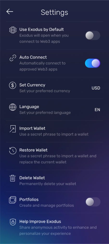
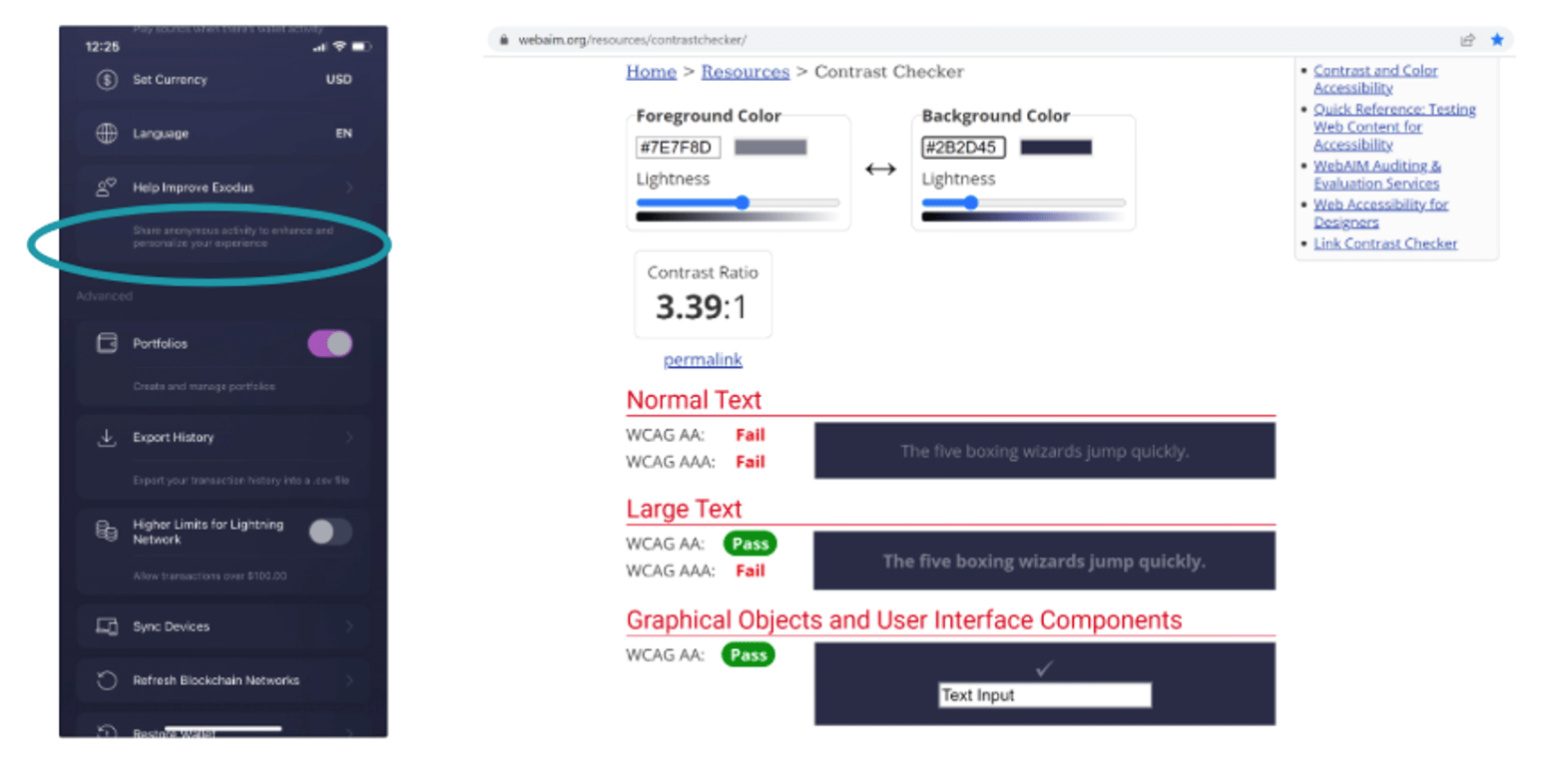
Beyond just just the content itself, the descriptions were also hard to read because of:
Small size
Poor contrast and color choice
My role
I initiated and led the redesign, driving alignment across designers and leadership while proposing the structure, designs, and rationale that moved it forward.
Goal
Make the Settings easier to scan
Reduce visual clutter and cognitive load
Prepare for future settings
Improve design consistency and support localization
Solution
I had worked on a similar cleanup while at Samsung, so I knew the same principles would apply here.
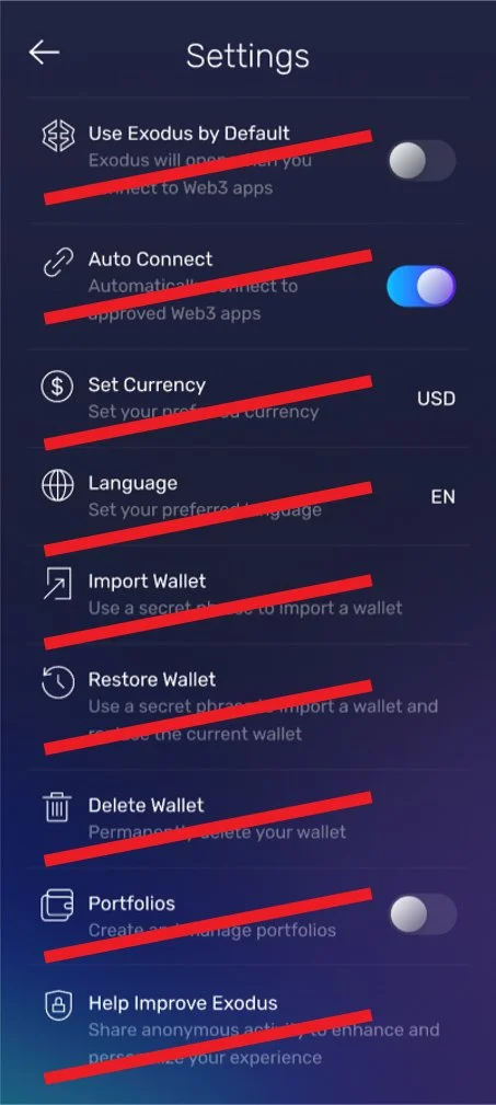
Remove descriptions or make them optional
Move details deeper in the flow, where they’re more relevant and helpful
Improve clarity, value, and conciseness
See if feature names could absorb description context
However, I needed to make a strong case to design leadership to ensure it would get shipped.
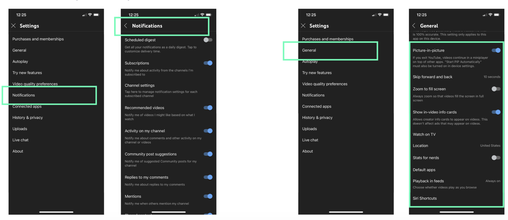
I opened the presentation with side-by-side comparisons from other major apps, aiming to spark motivation for change. If users closed a competitor’s app, then opened ours, they’d surely feel the bloat.
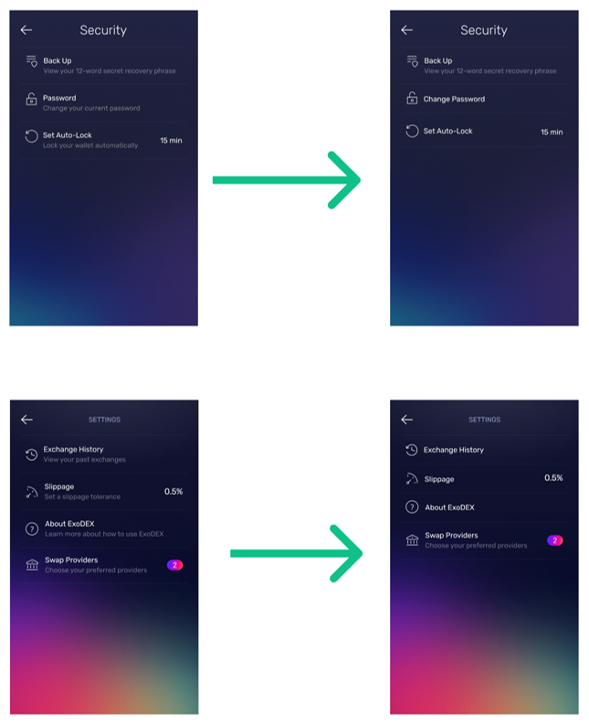
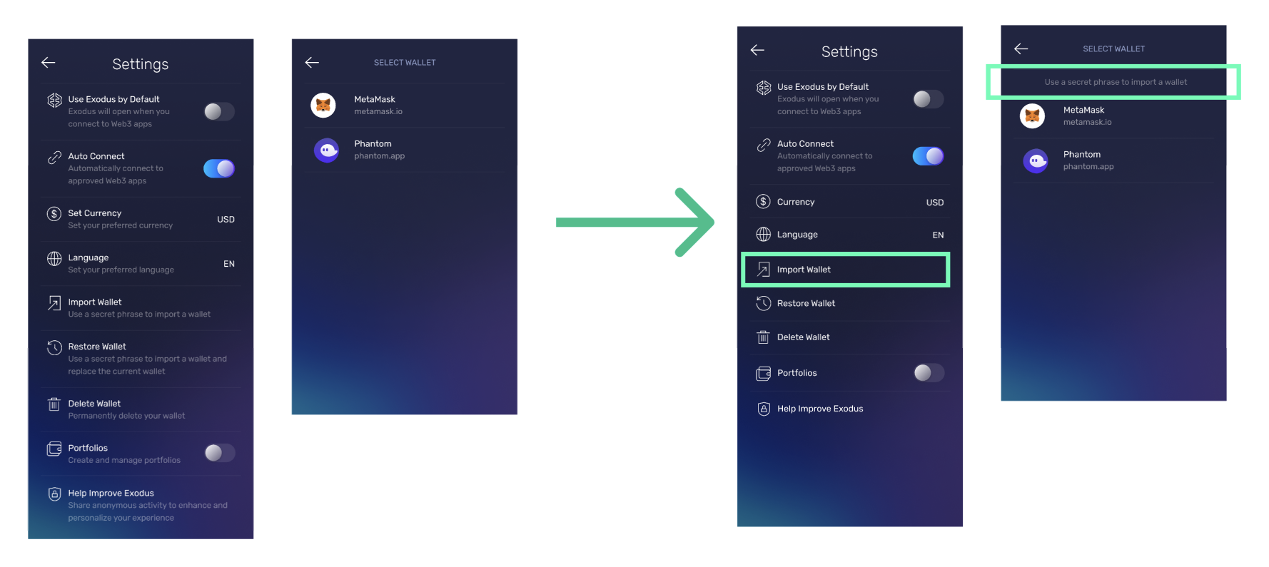
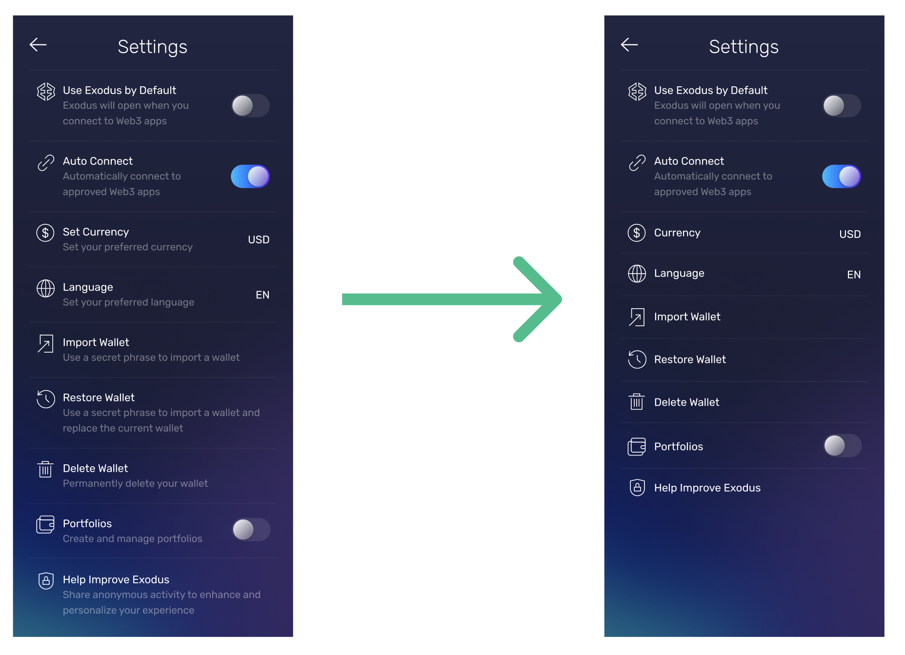
The final two slides on the right showed Exodus’s current Settings next to my proposed redesign.
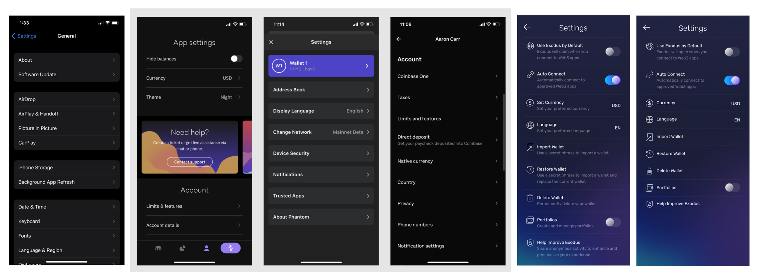
I used the browser extension wallet for these examples because changes there were less risky. Only about 1% of our users used it, which made it easier to get approval for an initial rollout.
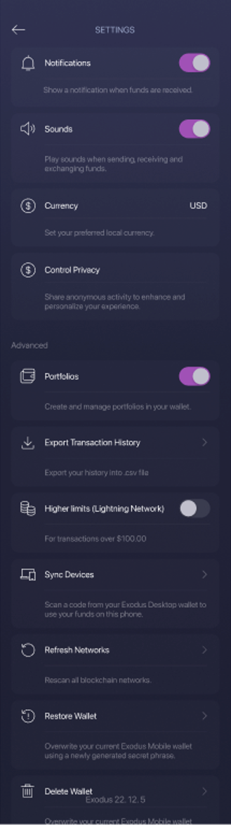
The mobile app, by contrast, had far more users and even worse settings. It also had a separate Security section, effectively creating an additional screen of settings.
I showed an example of Twitter saying the right thing at the wrong time.
It’s everything, all the time. This is what we wanted to avoid.
Using an outside product as an example helped me avoid coming off as if I’m criticizing our past design work.
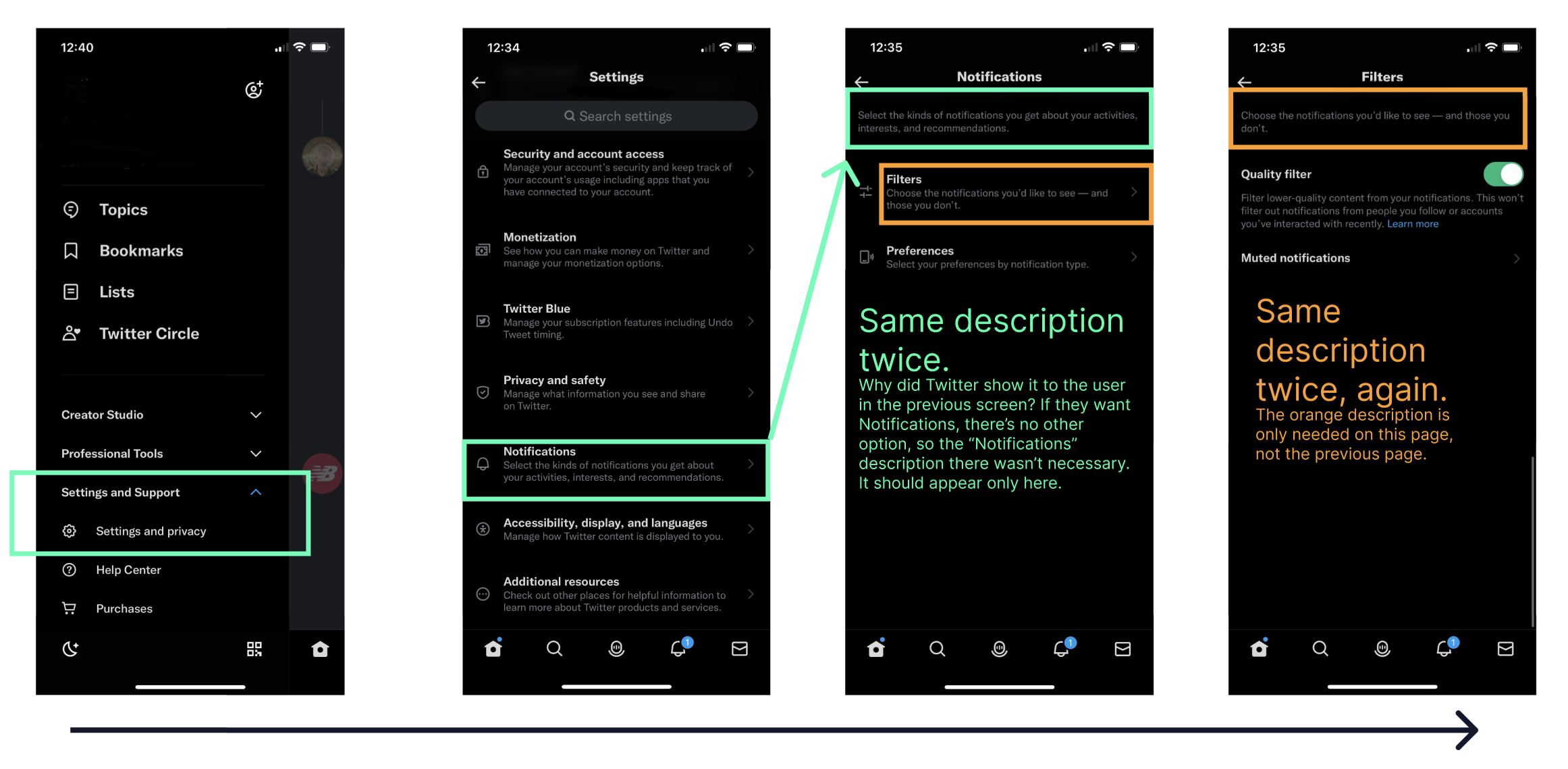
YouTube was a good example of not including a description for Notifications in the main Settings screen. The details only appear inside the Notifications section, where they’re needed.
Airbnb was shown as another example of how descriptions can be optional.
As mentioned before, there are other settings screens, such as Security. And we have multiple platforms and products. This new style could be applied globally to our design system.
Case-by-case exceptions are OK.
If a description is still needed for clarity, it can appear on the next screen instead of the main list.
Or just keep them as they are if they’re needed for clarity at the beginning.


Result
Design leaders approved the proposal, and the redesign went live.
Lighter and less redundant
Easier to scan menus
Reduced translation costs, design upkeep, and UI inconsistencies
Made Exodus feel faster and easier to use
Related updates made later
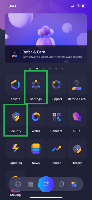
I noticed I often tapped Settings while trying to reach something in Security. I’d open Settings, realize what I wanted was in Security, then go back and open it separately.
I proposed merging the two into a single section, and other team members agreed this issue wasn’t only happening to me.
Settings in the mobile app were later updated to be even lighter. With Settings and Security merged and new features added, the list is still long, but now it’s much easier to scan, with everything in one place.
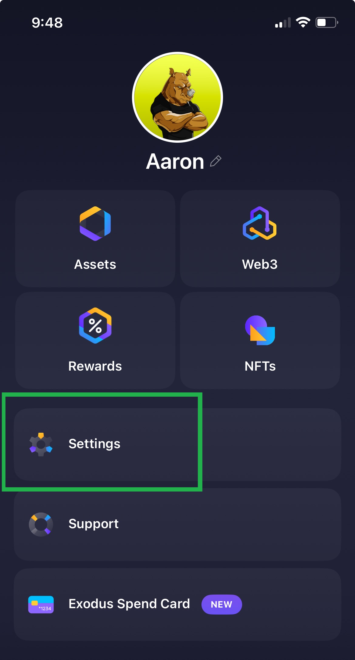
First image: top of the new Settings
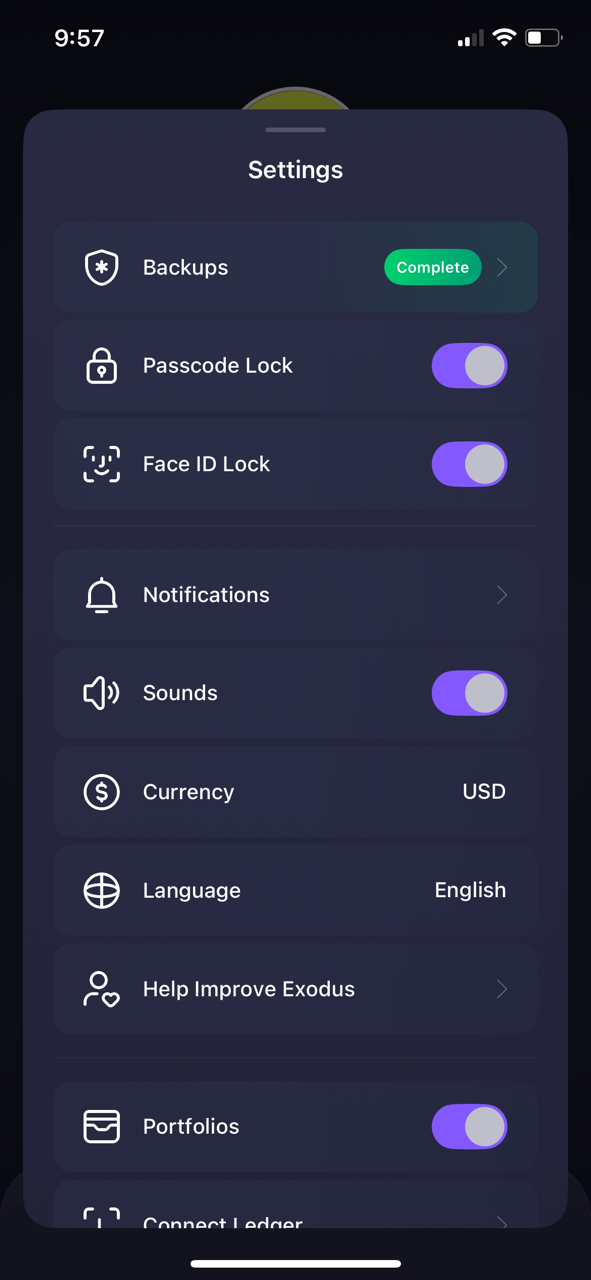
Second image: bottom of the new Settings
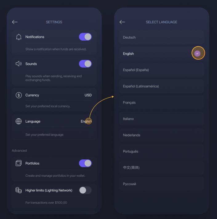
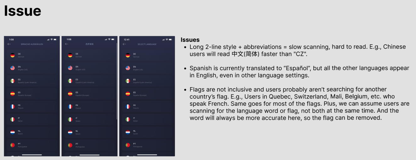
Language screen
(Settings subproject)
As part of my broader effort to improve Settings, I later proposed a redesign of the language selection screen to make it faster to scan, more accessible, and culturally neutral. This was another self-initiated project.
Note: Images in this subproject are taken directly from Asana and Figma.
Problems
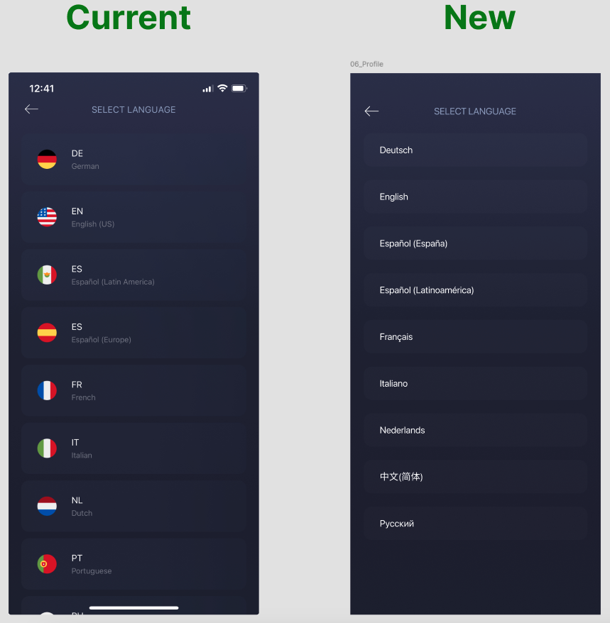
Long two-line labels with language codes, flags, and inconsistent translations
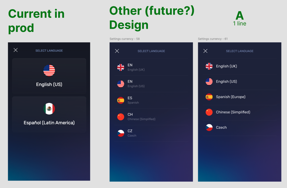
Flags were often exclusionary or irrelevant (especially for multilingual regions)
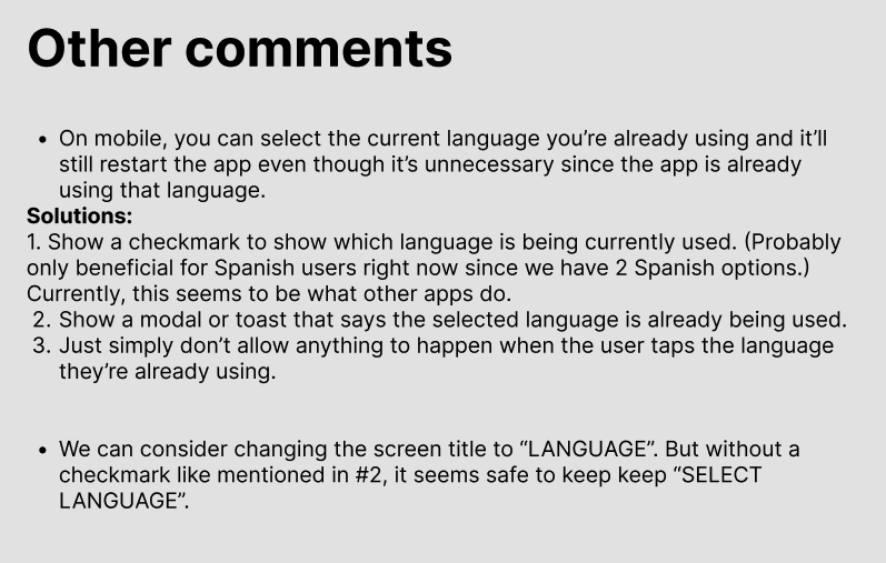
Selecting the current language unnecessarily restarted the app
Solution
I redesigned the language selection screen to be simpler, more accessible, and culturally neutral.
Key changes:
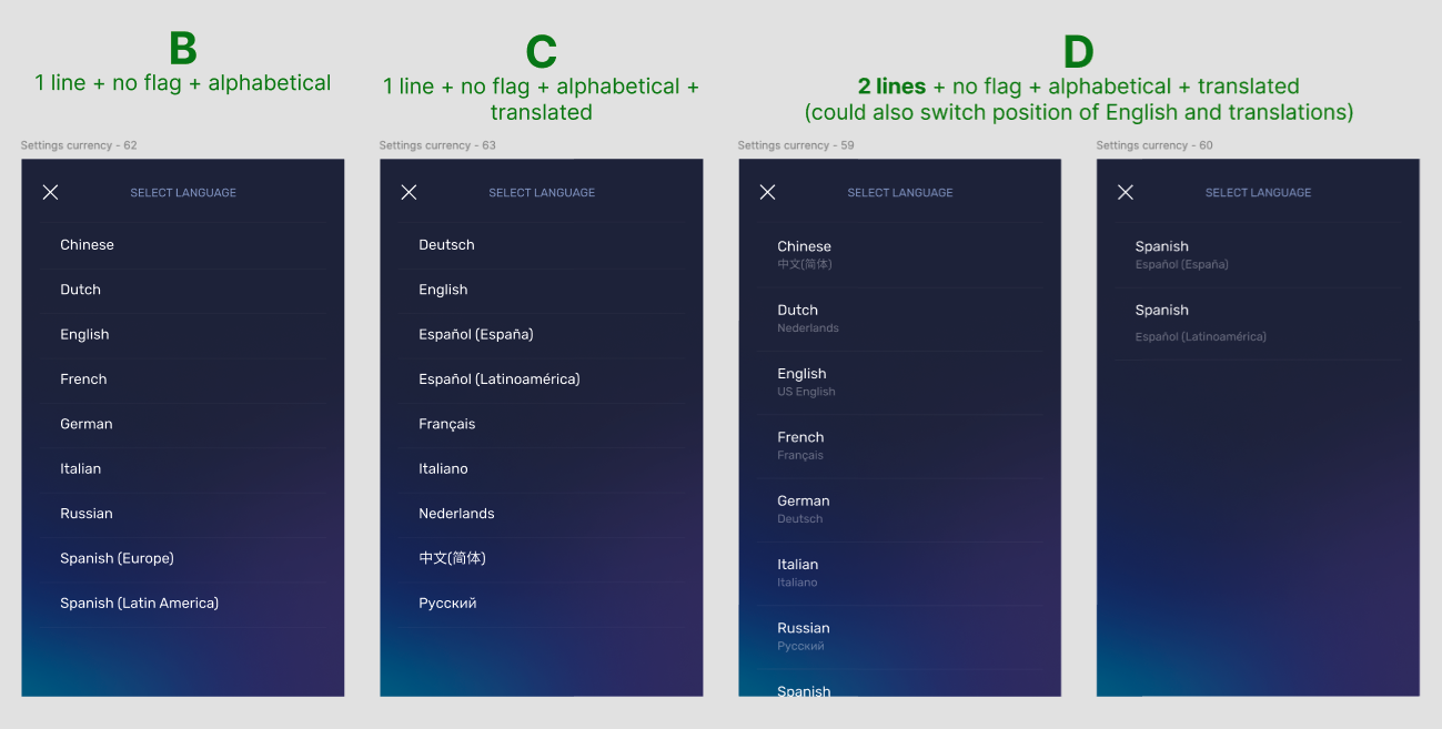
Using a single line per language
Showing translated language names instead of English-only labels
Removing flags to avoid cultural ambiguity
Alphabetizing consistently, with non-Latin alphabets grouped separately
Optionally showing a checkmark or message when selecting the current language
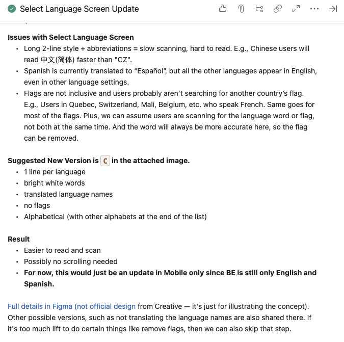
Result:
Created clear design options (A–D) to explore layout, translation, and accessibility trade-offs
Proposed a mobile-first version that improved scanability and reduced friction, especially for Spanish speakers using regional variants
Encouraged aligning UX with real-world user expectations seen in other major apps
The final design became neutral, inclusive, easy to scan, and correctly translated. All languages now fit on the screen without scrolling.
A checkmark was later added to show the current selection, so users no longer felt the need to reselect it, avoiding unnecessary app restarts.