Increasing Backups
Protected users from losing their funds and reduced backup-related support tickets by 57% in two months.
Problem
During an all-hands call, Support gave a presentation with many stories of customers permanently losing access to their funds after failing to save their 12-word recovery phrase.
I could see how devastating this was for customers, and how it hurt the company, so I asked my manager if I could spend some time on a personal project to tackle it.


Goals
Reduce support tickets related to lost wallets
Improve backup rates (so people don’t lose their money)
Make backups feel urgent and necessary, not just explain it
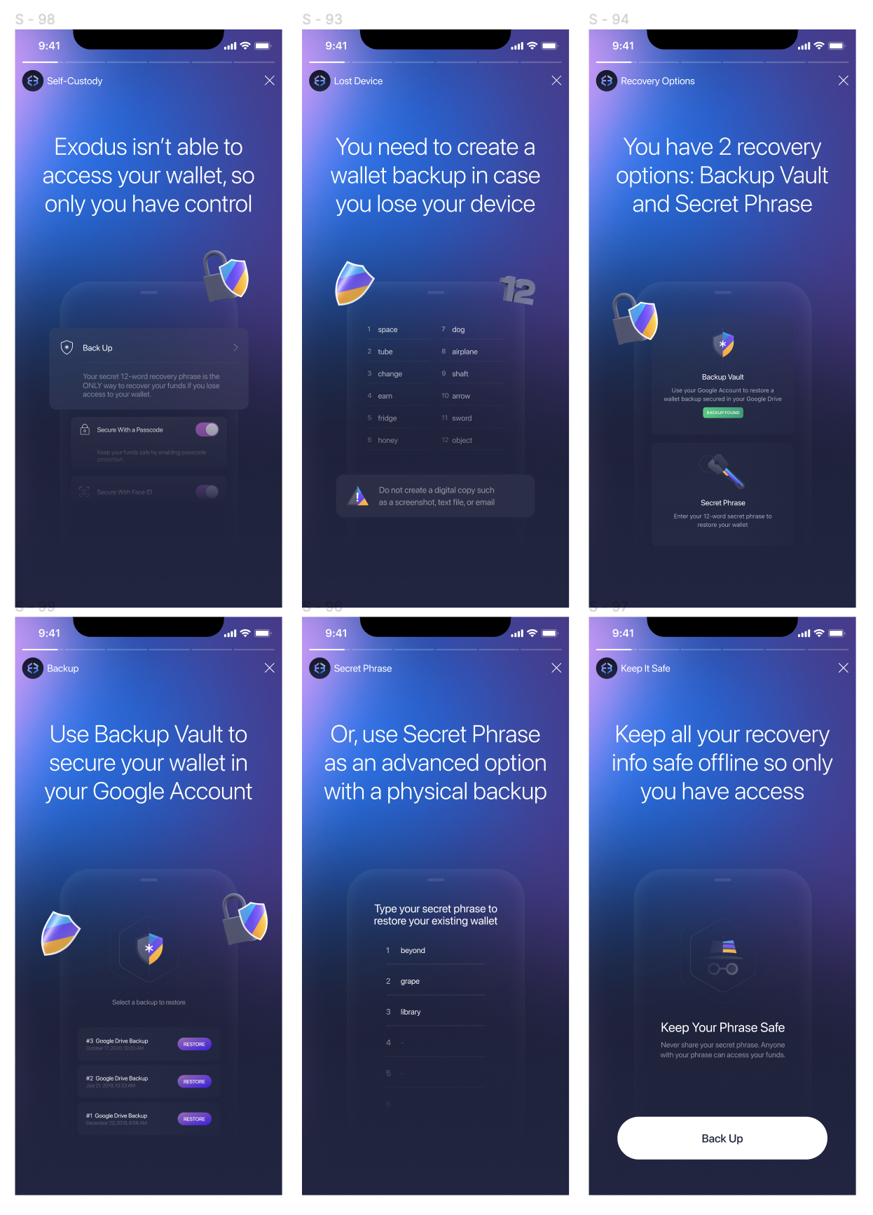
Existing content
There was already a fair amount of content throughout the app meant to educate users and guide them toward backing up, but it wasn’t effective enough.
In cases like this, I was often asked to simply rephrase existing content to include new details. But updating a few screens (like our 6-screen backup story and one or two other spots) wouldn’t have been enough. Plus, our UI didn’t have much space for extra text.
Also, Exodus was only in English at the time, so rephrasing copy may not have been effective for non-fluent English users.
I knew we needed something more obvious. Something concise and impossible to ignore.
To deliver the message at the right time and place, I reviewed the existing backup flow to identify opportunities to add new content or steps.
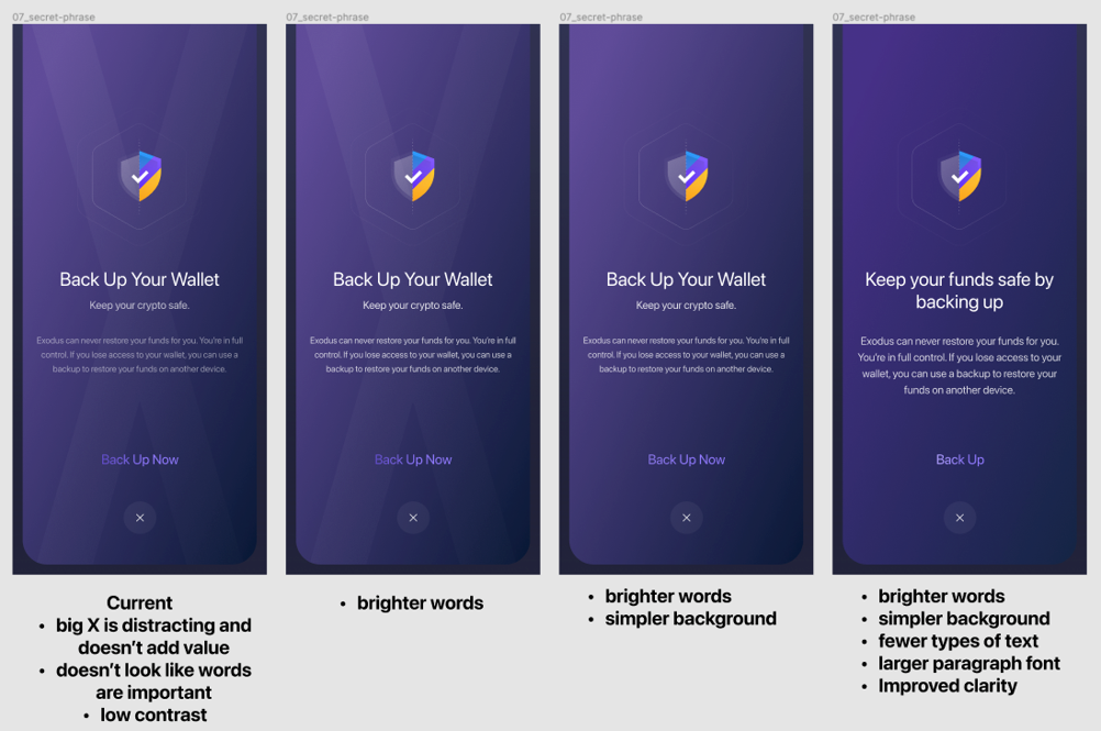
I also noticed that the way content was presented hurt comprehension, especially in the backup flow.
Here’s an example of how I showed ways to make our modals easier to read. This was out of scope for this specific project, so I didn’t start this discussion until after the project was done. I knew we needed something faster than major design changes that can’t be implemented quickly. Plus, there was usually pushback on changes like this, so this was temporarily set aside.
Brainstorming solutions
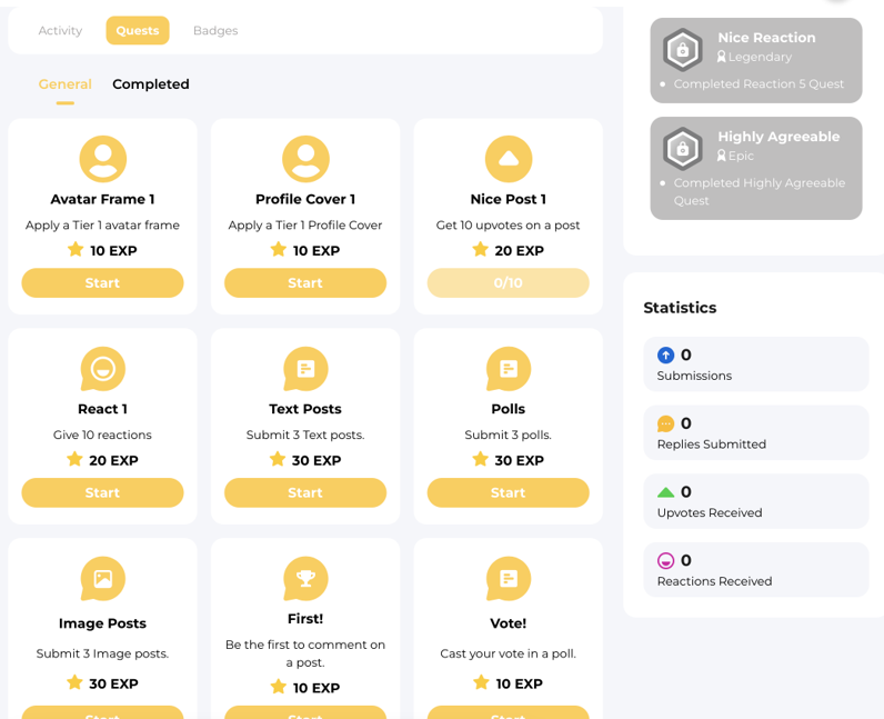
I explored ideas like using a badge or an element of gamification could incentivize the user to back up.
I drew inspiration from a small social media platform that treats completing a profile like a quest. To unlock full access to its features, users must complete prerequisites like adding a profile image or reacting to a post.
I didn’t want to block features in our app, but I saw value in making users feel something was incomplete if they hadn’t backed up yet.
I shared several concepts based on this idea with the lead UX designer, showing where icons and short messages could guide users toward the Backup feature without disrupting their experience.

Solution

We added components in key areas to inform and remind customers without long copy.
I wanted to make it feel like something was incomplete, not just explain it technically.
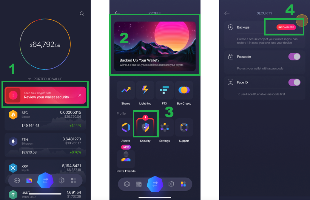
Dismissible banner on the portfolio screen educated users and guided to back up
Backup card linked directly to the backup process
“!” icon created a sense of urgency and nudged users to tap the Security tile
“Incomplete” pill in the Security section guided users to the Backups feature
These prompts appeared only if the wallet had funds, so users wouldn’t feel pressured when there was no risk yet.
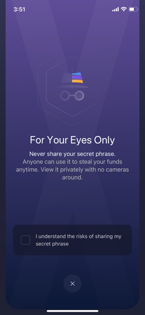
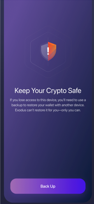
Modals periodically appeared to remind customers to back up their wallet.
We created four versions to make the message less repetitive.
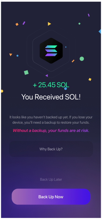
If the user hadn’t backed up yet, we also reminded them after they received money.
This avoided interrupting them when they have no funds yet, which would block revenue-generating actions.
This is another example of telling users the right thing at the right time.
Results
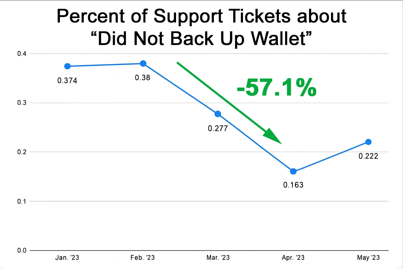

After launching the changes in February 2023, backup-related support tickets dropped by 57.1% within two months.
The second chart shows the total number of tickets (including all topics) did not go down. This shows the number of tickets specifically about backups drastically went down, independent of the overall number of support tickets.
The messaging became more accessible and intuitive, especially for non-native English speakers.
The solution was also cost-efficient by reducing support burden, improving user outcomes, and requiring minimal engineering effort to implement.